Assigning Data to a Plot

About Assigning Data to a Plot

You assign plot data when you add a plot to a graph or when you first create a graph from the Graph Gallery. Here are more details:
  • When you add a plot to a graph, an Assign Data dialog box appears in which you can assign a library, data set, and one or more plot variables.
    Note: If you are adding a plot overlay to a cell, you cannot change the library or the data set when you assign data. All plot layers in a cell must use a common data set.
  • If you create a graph from the Graph Gallery, the graph has placeholder data assigned to its plots. For this pre-assigned data, the designer uses data from the WORK, SASHELP, or the SASUSER library. You can change the data that is associated with the plot or plots in the graph.
Regardless of the method used to create a graph, you can later change the data for all plots in a cell of a graph.

About Plot Roles

When you assign data to a plot, you can assign variables to various plot roles.
A role is a generic term for the purpose that a variable serves in a plot. All plots have predefined roles. For example, a scatter plot includes roles named for X , Y, Group, Data Label, Error Upper and Error Lower. A bar chart includes roles named Category, Response, Group, and URL. In the scatter plot example, you might assign a data variable WEIGHT to the plot role X.

Assign Data to a New Plot

For each new plot that you add to a graph, you assign data in the Assign Data dialog box. The fields on this dialog box vary by plot. The Assign Data dialog box displays the plot type in its title bar.
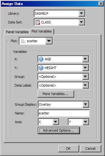
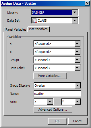
The following display shows the Assign Data dialog box that appears when you add a scatter plot.
Assign Data Dialog Box for a Scatter Plot That is Added to a Graph
Assign Data dialog box
The dialog box appears automatically when you add the plot to a graph.
Note: If you are changing the data for an existing plot, see Change the Data Assignment for a Plot in a Graph.
To assign data to a plot:
  1. In the Assign Data dialog box, specify the SAS library and data set that you want to use for the plot. Select the appropriate items from the Library and Data Set list boxes.
    All plot layers in a cell must use a common data set. If you are adding a plot overlay to an existing plot in a cell, you cannot change the library or the data set at this time.
  2. In the Variables section, assign a data variable to each plot role that is listed. (Some roles might be optional.) To assign a variable, select the variable from the list box next to the role's label. For more information about the roles, see Summary of Plot Roles and Data Attributes.
    If the More Variables button is available, then you can click this button to assign variables to additional plot roles. In the scatter plot example, this option enables you to set error upper and error lower limits.
  3. If the Fit an existing plot check box is available, select the check box to match the variables of the plot to those of another plot. This check box is available only for specific plot overlays, such as a Loess plot over a scatter plot or a normal plot over a histogram.
    If you select the check box, make sure that the plot that you want to fit appears in the Plot list box.
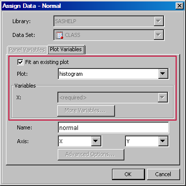
    The following display shows the Assign Data dialog box for a normal density plot that is overlaid on a histogram.
    Fit an Existing Plot fields
    In the example, the check box is selected. This setting indicates that the X role of the normal plot is matched to that of the histogram. Accordingly, the X list box is dimmed. If you clear the Fit an existing plot check box, then you must assign a variable to the X role.
  4. (Optional) If you want a more descriptive name for the plot, enter the name in the Name text box. This name identifies the plot in the Assign Data dialog box, in the Cell Properties dialog box, in the Legend Contents dialog box, and other places within the application.
    By default, the designer uses generic names for each plot. It is good practice to assign a descriptive name that indicates a response variable or some identifying characteristic of the plot.
  5. (Optional) Specify use of a secondary axis (X2, Y2, or both X2 and Y2). The secondary axis is a duplicate of the X or Y axis, and is displayed on the opposite side of the cell area from the primary axis.
    Note: You cannot specify a secondary axis if the graph is a classification panel.
  6. If the Advanced Options button is available, you can click this button to specify additional options.
    Advanced options typically involve computational settings. For example, for plots that have confidence limits, this feature enables you to set the alpha value, the degree, and the interpolation.
  7. If you want to create a classification panel, click the Panel Variables tab and select one or more classification variables. For instructions, see Creating a Classification Panel.
    The Panel Variables tab is not available for multi-cell graphs (graphs that have more than one column or row).

Change the Data Assignment for a Plot in a Graph

After a graph has been created, you can change the data assignment for one or more plots in the graph. You also change the data assignment for one or more plots when you open a graph from the Graph Gallery. (Placeholder data is assigned to plots for the graphs in the gallery.)
You assign data in the Assign Data dialog box. The fields on this dialog box vary by plot. The following display shows the Assign Data dialog box for a scatter plot.
Example Assign Data Dialog Box for Scatter Plot Data
Assign Data Dialog Box for Changing Scatter Plot Data
Depending on how you opened the graph, the Assign Data dialog box appears as follows:
  • If you open a graph that you have already created, then you must open the dialog box manually (as described in the following procedure).
  • The dialog box appears automatically when you open a graph from the Graph Gallery.
    Exception: The Assign Data dialog box does not open if you select a multi-cell graph from the gallery. After opening a multi-cell graph, to customize the data for the various plots in the graph, you must open the Assign Data dialog box for each cell individually.
To change the data assignment for a plot:
  1. Open the Assign Data dialog box if it is not already open. To open the dialog box, right-click inside the graph cell that contains the plot whose data you want to modify, and select Assign Data.
    The Assign Data dialog box appears.
    Note: Alternatively, right-click directly on the plot and select Assign Data. This action opens the Assign Data dialog box with the plot already selected.
  2. If you want to change the SAS library and data set, select the appropriate items from the Library and Data Set list boxes.
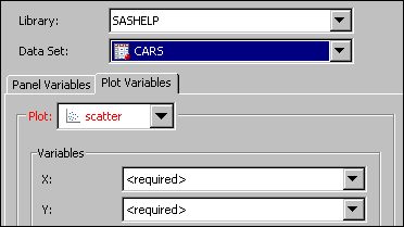
    After you change the library or data set, the plot labels might appear red. This color indicates that required variables do not exist in the new data set, and that you must assign variables for the plots. When you assign variables for any of these plots, the plot name changes to black.
    Red plot labels in the Assign Data dialog box
  3. Make sure that the Plot list box displays the plot that you want to modify. If necessary, select a different plot from the list box.
  4. In the Variables section, assign a data variable to each plot role that is listed. (Some roles might be optional.) To assign a variable, select the variable from the list box next to the role's label. For more information about the roles, see Summary of Plot Roles and Data Attributes.
    If the More Variables button is available, then you can click this button to assign variables to additional plot roles. In the scatter plot example, this option enables you to set error upper and error lower limits.
  5. If the Fit an existing plot check box is available, select the check box to match the variables of the plot to those of another plot. This check box is available only for specific plot overlays, such as a Loess plot over a scatter plot or a normal plot over a histogram.
    If you select the check box, make sure that the plot that you want to fit appears in the Plot list box.
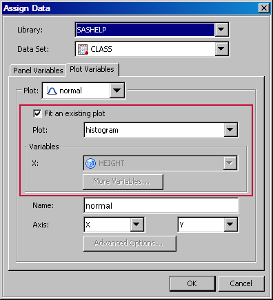
    The following display shows the Assign Data dialog box for a normal density plot that is overlaid on a histogram.
    Fit an Existing Plot fields
    In the example, the check box is selected. This setting indicates that the X role of the normal plot is matched to that of the histogram. Accordingly, the X list box is dimmed. If you clear the Fit an existing plot check box, then you must assign a variable to the X role.
  6. (Optional) If you want a more descriptive name for the plot, enter the name in the Name text box. This name identifies the plot in the Assign Data dialog box, in the Cell Properties dialog box, in the Legend Contents dialog box, and in other places within the application.
    By default, the designer uses generic names for each plot. It is good practice to assign a descriptive name that indicates a response variable or some identifying characteristic of the plot.
  7. (Optional) Specify use of a secondary axis for the X axis, the Y axis, or both X and Y axes. The secondary axis is a duplicate of the X or Y axis, and is displayed on the opposite side of the cell area from the primary axis.
    Note: You cannot specify a secondary axis if the graph is a classification panel.
  8. If the Advanced Options button is available, you can click this button to specify additional options.
    Advanced options typically involve computational settings. For example, for plots that have confidence limits, this feature enables you to set the alpha value, the degree, and the interpolation.
  9. If the graph contains another plot whose variables you want to change, select the plot from the Plot list box. Then change the variables for the plot.
  10. If you want to create a classification panel, click the Panel Variables tab and select one or more classification variables. For instructions, see Creating a Classification Panel.
    The Panel Variables tab is not available for multi-cell graphs (graphs that have more than one column or row).

Summary of Plot Roles and Data Attributes

In the Assign Data dialog box, you assign data variables to various plot roles, such as X, Y, and so on. The roles that are available depend on which type of plot you are editing.
You can also assign data attributes, such as data labels, to some plots.
The following list summarizes the roles that you can specify for plots:
X, Y, or Z Roles
For most of the plots, you assign the variable for the X role, the Y role, or both roles. These roles correspond to the X and Y axes. (Exceptions include bar charts, which have category and response roles instead.)
For the contour plot, you also assign a variable for the Z role.
Group Role
Several types of plots enable you to specify a variable for grouping the data. Scatter plots, series plots, step plots, bar charts, box plots, needle plots, and vector plots support this role in the designer.
For example, in a scatter plot, you might specify a group variable of ORIGIN, where ORIGIN contains values for the country of origin. In this example, the plot marker colors and symbols are different for different countries of origin.
Group Display
For some plot types, when you group the data, you can also specify how the grouped plot elements appear in the graph. Scatter plots, series plots, step plots, needle plots, box plots, and bar charts support this feature.
Here are the options:
Cluster
the plot elements are displayed adjacent to each other.
Overlay
(all except bar charts) the plot elements for a given group value are drawn at the exact coordinate and might overlap. Each group is represented by unique visual attributes.
Stack
(bar charts) groups are overlaid without any clustering.
This feature is applicable only when a variable has been assigned to the Group role. In addition, the feature is not available when a discrete offset other than 0 has been specified for the plot.
Discrete Offset
For some plot types, you can specify an amount to offset all plot elements from the discrete tick marks. Specify a value from -0.5 (left offset) to +0.5 (right offset). Scatter plots, series plots, step plots, needle plots, box plots, and bar charts support this feature.
To access the Discrete Offset option, click Advanced Options in the Assign Data dialog box.
Tip
You can also select a plot element and drag it to the desired offset position.
This feature is not available when the group display feature has been specified with a value of CLUSTER.
Data Label, Curve Label
You can display the data label for each observation in a scatter plot, and a curve label for a series or a step plot.
For scatter plots, you assign the variable that you want to use for labels.
For series and step plots, you provide the text that you want to appear next to the plot curve. If you have specified a group variable, then you select a variable for the label.
Error Upper, Error Lower
Some plots can display the upper and lower error (or confidence or prediction) limits for the data. You compute these error values in advance as variables in the data set. Then, you assign the variables to the appropriate role for the plot.
You can specify error upper and error lower variables for scatter plots, step plots, and bar error plots. For scatter plots, you can specify the variables for both the X and the Y axes. You might need to click the More Variables button to assign these variables to the appropriate roles.
Connect Order
This option is available for plots such as series or step plots. The connect order specifies how to connect the data points to form the step or line. Select X Axis to connect data points as they occur minimum-to-maximum along the X axis. Select X Values to connect data points in the order read from the X variable. X Axis is the default.
To access this option when assigning data for series or step plots, click the Advanced Options button.
Bar Chart and Bar Error Chart Data
For bar charts, you provide a category variable and an optional response variable. If you do not specify a response variable, then the designer displays the frequency for the category variable.
Here are additional options:
  • The Group role creates a separate bar segment for each unique group value in each category. You can also use the Group Display option to specify whether bars are stacked or clustered. For more information, see Group Display.
  • Bar Width enables you to specify the width of the bars as a ratio of the maximum possible width. The maximum width is equal to the distance between the center of each bar and the centers of the adjacent bars. Specify a value from 0.0 (narrowest) to 1.0 (widest).
    For example, if you specify a width of 1.0, then there is no space between the bars. If you specify a width of 0.5, then the width of the bars is equal to the space between the bars.
    To access this option, click Advanced Options in the Assign Data dialog box.
    Tip
    This feature is also available as a plot property. You can also click and drag a bar edge to change the bar width.
  • The URL role enables a URL link to be associated with each bar or bar segment. If the graph is saved as an HTML output file, then clicking on each bar navigates to the specified HTML page.
    You assign the variable that contains the URL values. Here is an example URL:
    http://www.sas.com/technologies/analytics/index.html
    For non-grouped data, the values of the variable are expected to be the same for each unique X.
  • You can specify the statistic to be computed for the Y axis. When the response variable is selected, the default statistic is SUM. When the response variable is not selected, the default statistic is FREQ.
  • Discrete Offset enables you to specify an amount to offset all bars from the category midpoints. To access this option, click Advanced Options in the Assign Data dialog box. For more information, see Discrete Offset.
    Tip
    You can also select a plot element and drag it to the desired offset position.
For Bar Error charts, the category variable should not have repeated values. You can specify upper error and lower error limits.
Box Plot Data
For box plots, you specify variables for the X and Y roles.
Here are additional options:
  • The Group role creates a separate box segment for each unique group value in each category. You can also use the Group Display option to specify whether boxes are overlaid or clustered. For more information, see Group Display.
  • Box Width enables you to specify the width of the boxes as a ratio of the maximum possible width. Specify a value from 0.0 (narrowest) to 1.0 (widest).
    For example, if you specify a width of 1.0, then there is no space between the boxes. If you specify a width of 0.5, then the width of the boxes is equal to the space between the boxes.
    To access this option, click Advanced Options in the Assign Data dialog box.
    Tip
    This feature is also available as a plot property. You can also click and drag a box edge to change the box width.
  • Discrete Offset enables you to specify an amount to offset all boxes from the tick marks. To access this option, click Advanced Options in the Assign Data dialog box. For more information, see Discrete Offset.
    Tip
    You can also select a plot element and drag it to the desired offset position.
Histogram Bin Data
For histograms, you can specify these advanced options:
  • bin width. Changing the bin width can also result in a different number of bins.
  • bin starting position. This value sets the X coordinate of the first bin for the histogram. The bin is drawn only if it contains data.
Band Data
For band plots, in addition to the X variable, you can specify the upper and lower limits for the band.
You can specify a numeric data variable for the limits by selecting the variable from the Limit Upper and the Limit Lower list boxes. Alternatively, to specify a constant value, select Constant: <type value> from the list box. Then type the value.
Vector Origin Data
For vector plots, in addition to the X and Y variables, you can specify the vector origin.
You can specify a numeric data variable to use for the origin by selecting the variable from the XOrigin or the YOrigin list box. Alternatively, to specify a constant coordinate, such as 0.0, select Constant: <type value> from the list box. Then type the coordinate value.
Contour Data
For a contour plot, you must specify grid data for the contour X and Y roles, with a Z value for each (X,Y) crossing.
The Contour Type list box enables you to specify how the contour is displayed as follows:
Line displays contour levels as unlabeled lines.
Fill displays the area between the contour levels as filled. Each contour interval is filled with one color.
Gradient displays a smooth gradient of color to represent contour levels.
LineFill combines the Line and Fill types. Each contour interval is filled with one color. Displays contour levels as unlabeled lines.
LineGradient combines the Line and Gradient types. Displays contour levels as unlabeled lines.
LabeledLine adds labels to the Line type. Displays contour levels as labeled lines.
LabeledLineFill adds labels to the LineFill type. Each contour interval is filled with one color. Displays contour levels as lines with labels showing contour level values.
LabeledLineGradient adds labels to the LineGradient type. Displays contour levels as lines with labels showing contour level values.
Loess, Regression, PBSpline, and Model Band Data
You can select the Fit an existing plot check box to match the variables of an overlaid loess, regression, or PBSpline (penalized B-spline) plot to those of a scatter plot.
You can also enable the following model band options:
CLM
creates confidence limits. This option is available for all three plots. The confidence level is set by the alpha value.
CLI
produces confidence limits for individual predicted values for each observation. This option is available for regression and PBSpline plots. The confidence level is set by the alpha value.
You can specify the following by clicking Advanced Options:
Alpha value
specifies the confidence level to compute. The default is 0.05, which represents a 95% confidence level.
Degree
specifies the degree of the polynomial that is computed. A degree of one produces a linear fit, a degree of two produces a quadratic fit, and so on. The available degrees are shown here:
Plot
Degrees Available
Loess
one and two
PBSpline
one, two, and three
Regression
one through five
Interpolation
specifies the degree of the interpolating polynomials that are used for blending local polynomial fits at the vertices. This value is used with loess plots. Possible choices are Linear (default) and Cubic.
Reference and Drop Lines
You can specify the position and other information for horizontal, vertical, and sloped reference lines as well as for drop lines. For more information, see Adding Reference Lines to Graphs.
Block, Stack Block Data
Block plots create one or more strips of rectangular blocks containing text values. The width of each block corresponds to specified numeric intervals along the X-axis. The height of the blocks represents the value of the chart statistic for each category of data.
You select an X variable and a block variable. If the X variable is numeric, values are expected to be in sorted, ascending order.
You can assign a position for the plot. Most block plots are positioned in the center of the graph area. When you combine a block plot with another plot in an overlay, the block plot can be positioned in the top or bottom margin of the graph.
For a stacked block, you must also specify a group variable.