Fit and Confidence Plots

About Fit and Confidence Plots

You can use the SGPLOT and SGPANEL procedures to produce fit plots and ellipses (the ellipses plot is available with the SGPLOT procedure only). Fit plots represent the line of best fit (trend line) with confidence limits.
The plot statements include many options for controlling how the output is displayed. The options that are available depend on the plot type. However, some general options apply to most of the fit and confidence plots. For example, options enable you to do the following:
  • add confidence limits (CLM) to the plot. When you add CLM limits, you can specify the confidence level, the transparency for the confidence limits, and other visual attributes. You can add CLM limits to loess, penalized B-spline, and regression plots.
  • add prediction limits (CLI) for the individual predicted values. When you add CLI limits, you can specify the text that appears for the limits and other visual attributes. You can add CLI limits to penalized B-spline and regression plots.
  • control the appearance of the markers and the fit line. You can also specify a smoothing parameter.
  • add and customize curve and data labels.
  • specify legend labels. You can also show or hide the legend entries for the CLM limits, the CLI limits, and the fit line.
  • group the data by the values of a variable. A separate plot is created for each unique value of the grouping variable. The plot elements for each group value are automatically distinguished by different visual attributes.
  • specify the value of an ID variable in an attribute map data set. You specify this option only if you are using an attribute map to control visual attributes of the graph.
Note: Not all of these features are available for all of the plots. Also, the list does not include all available options.
The fit and confidence plots are described in the following sections. If you run the examples, your output might differ somewhat depending on the size of your graphics. The examples here were specified to be a particular size using the following statement:
ods graphics on / width=4in;

About Ellipse Plots

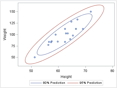
Ellipse plots create a confidence elliptical curve computed from input data. In order to produce useful output, the ELLIPSE statement should be used with another plot statement that uses numeric axes. Ellipses are available only for the SGPLOT procedure. The SGPANEL procedure does not support ellipses.
The following example shows the relationship of height to weight for a class of students. The example consists of a scatter plot and two ellipses.
Here are the noteworthy features of the example:
  • Both ELLIPSE statements use TYPE=PREDICTED. This is the default.
  • One ELLIPSE statement uses ALPHA=.2 and the other uses ALPHA=.05.
  • The automatically generated legend, which contains an entry for each ellipse and for the scatter plot, has been suppressed. Only the ellipses require a legend.
  • A legend was created that contains entries only for the ellipses. Each ELLIPSE statement specifies a legend label and a plot name. The KEYLEGEND statement uses the NAME value to determine the entries in the legend.
Ellipse plot
proc sgplot data=sashelp.class
      noautolegend;
  scatter x=height y=weight;
  ellipse x=height y=weight /
     alpha=.2
     name="eighty"
     legendlabel="80% Prediction";
  ellipse x=height y=weight /
     alpha=.05
     name="ninetyfive"
     legendlabel="95% Prediction";
  keylegend "eighty" "ninetyfive";
run;

See Also

ELLIPSE Statement (SGPLOT procedure)

About Loess Plots

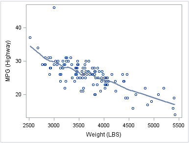
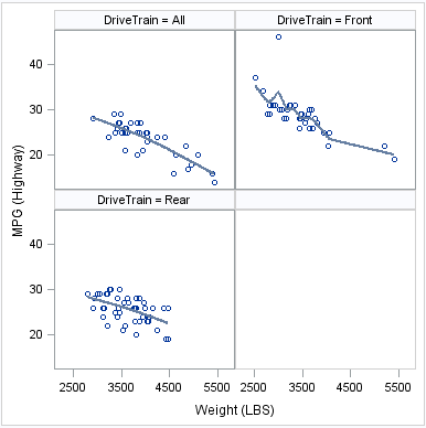
A loess plot includes a scatter plot of two numeric variables along with an overlaid nonlinear fit line that enables you to perform locally weighted polynomial regression. You can specify the degree of the local polynomials to use for each local regression. You can also change the default smoothing technique that is applied to the fit.
The following examples show the relationship of height to weight and the line of best fit for a class of students. Examples are provided for the SGPLOT and the SGPANEL procedures. In both examples, the automatically generated legend for the fit line is not needed and has been suppressed.
Loess plot
proc sgplot data=sashelp.cars
     noautolegend;
  where (origin = "Europe");
  loess x=weight y=mpg_highway;
run;
Loess panel
proc sgpanel data=sashelp.cars
      noautolegend;
  where (origin = "Europe");
  panelby drivetrain;
  loess x=weight y=mpg_highway;
run;

See Also

LOESS Statement (SGPANEL procedure)
LOESS Statement (SGPLOT procedure)

About Penalized B-Spline Plots

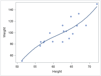
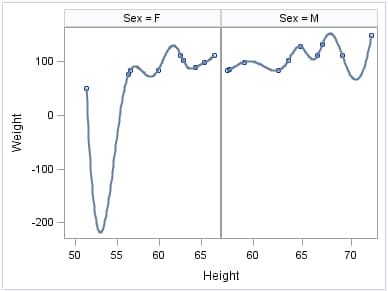
A penalized B-spline curve includes a scatter plot of two numeric variables along with an overlaid nonlinear fit line. You can specify the degree of the local polynomials to use for each local regression. You can also change the default smoothing technique that is applied to the fit.
The following examples show the relationship of height to weight and the line of best fit for a class of students. Examples are provided for the SGPLOT and the SGPANEL procedures. In both examples, the automatically generated legend for the fit line is not needed and has been suppressed.
Penalized B-Spline plot
proc sgplot data=sashelp.class
     noautolegend;
  pbspline x=height y=weight;
run;
Penalized B-Spline panel
proc sgpanel data=sashelp.class
     noautolegend;
  panelby sex / uniscale=row;
  pbspline x=height y=weight;
run;

See Also

PBSPLINE Statement (SGPANEL procedure)
PBSPLINE Statement (SGPLOT procedure)

About Regression Plots

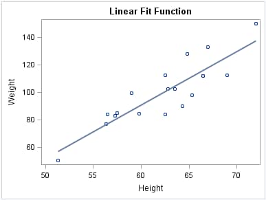
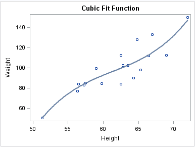
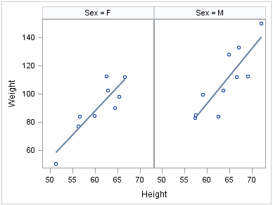
A regression plot includes a scatter plot of two numeric variables along with an overlaid linear or nonlinear fit line that enables you to perform a regression analysis. You can specify one of three types of regression equation: linear, quadratic, or cubic. You can display confidence limits for mean predicted values or individual predicted values.
The following examples show the relationship of height to weight and the line of best fit for a class of students. Examples are provided for the SGPLOT and the SGPANEL procedures. The first two examples show the same plot with a linear and a cubic fit line, respectively. The third example shows a paneled graph. In all three examples, the automatically generated legend for the fit line is not needed and has been suppressed.
Regression plot
title "Linear Fit Function";
proc sgplot data=sashelp.class
    noautolegend;
  reg x=height y=weight;
run;
title;
Regression plot, cubic fit curve
title "Cubic Fit Function";
proc sgplot data=sashelp.class
    noautolegend;
  reg x=height y=weight / degree=3;
run;
title;
Regression panel
proc sgpanel data=sashelp.class
    noautolegend;
  panelby sex;
  reg x=height y=weight;
run;

See Also

REG Statement (SGPANEL procedure)
REG Statement (SGPLOT procedure)