Distribution Plots

About Distribution Plots

You can use the SGPLOT and SGPANEL procedures to produce plots that characterize the frequency or the distribution of your data.
The plot statements include many options for controlling how the output is displayed. The options that are available depend on the plot type. The following sections describe each plot and the options that are available.
The distribution plots are described in the following sections. If you run the examples, your output might differ somewhat depending on the size of your graphics. The examples here were specified to be a particular size using the following statement:
ods graphics on / width=4in;

About Box Plots

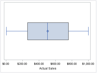
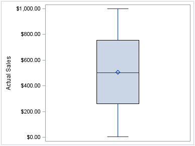
A box plot summarizes the data and indicates the median, upper and lower quartiles, and minimum and maximum values. The plot provides a quick visual summary that easily shows center, spread, range, and any outliers. The SGPLOT and the SGPANEL procedures have separate statements for creating horizontal and vertical box plots.
The following examples show product sales summaries. Examples are provided for the SGPLOT and the SGPANEL procedures.
The following two examples use the SGPLOT procedure to create a horizontal and a vertical plot, respectively.
Horizontal box plot
proc sgplot data=sashelp.prdsale;
  hbox actual;
run;
Horizontal box plot
proc sgplot data=sashelp.prdsale;
  vbox actual;
run;
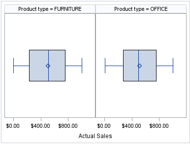
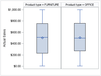
The following two examples use the SGPANEL procedure to create a horizontal and a vertical plot, respectively. The box plots are paneled by product type.
Horizontal box plot
proc sgpanel data=sashelp.prdsale;
  panelby prodtype;
  hbox actual;
run;
Vertical box plot
proc sgpanel data=sashelp.prdsale;
  panelby prodtype;
  vbox actual;
run;
Options are available that enable you to customize the box plot and enhance its appearance. For example, you can do the following:
  • control the box width, the whisker cap shape, and the visual attributes for the mean marker, median line, and the connect lines. You can also hide the whisker caps, mean marker, median line, and the outliers.
  • specify data labels and font attributes for the labels.
  • specify the method to use for computing the percentiles for the plot.
  • group the data by the values of a variable. A separate plot is created for each unique value of the grouping variable. The plot elements for each group value are automatically distinguished by different visual attributes.
  • control the display of grouped boxes. For example, you can specify whether the boxes are overlaid or clustered, and the width of each cluster.
  • specify an amount to offset graph elements from the category midpoints or from the discrete axis tick marks.
  • specify legend labels and plot transparency.
  • assign the analysis variable to the secondary axis (X2 or Y2). This option is available only for the SGPLOT procedure.
  • specify the value of an ID variable in an attribute map data set. You specify this option only if you are using an attribute map to control visual attributes of the graph.
Note: This list does not include all available options.

See Also

HBOX Statement (SGPANEL procedure)
VBOX Statement (SGPANEL procedure)
HBOX Statement (SGPLOT procedure)
VBOX Statement (SGPLOT procedure)

About Density Plots

After creating a histogram, you might use a density plot to fit various distributions to the data. The most common density plot uses the normal distribution, which is defined by the mean and the standard deviation.
A density plot can be used by itself, combined with another density plot, and overlaid on a histogram.
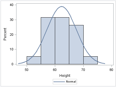
The following examples show a density plot overlaid on a histogram. Examples are provided for the SGPLOT and the SGPANEL procedures.
Density plot over a histogram
proc sgplot data=sashelp.class;
  histogram height;
  density height;
run;
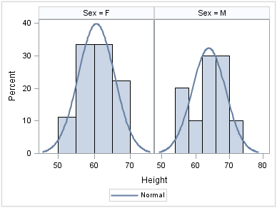
The SGPANEL example shows output that is paneled by gender. The UNISCALE= ROW option specifies that only the shared row axes are identical. The column axes vary based on the values of the height for the respective genders.
Density plot over a histogram
proc sgpanel data=sashelp.class;
 panelby sex /
    uniscale=row;
 histogram height;
 density height;
run;
Options are available that enable you to customize the density plot and enhance its appearance. For example, you can do the following:
  • control the visual attributes of the density line.
  • specify a kernel distribution instead of normal. You can also specify the scaling that is used for the response axis.
  • specify legend labels and plot transparency.
Note: This list does not include all available options.

See Also

DENSITY Statement (SGPANEL procedure)
DENSITY Statement (SGPLOT procedure)

About Histograms

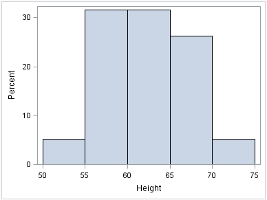
Histograms consist of a series of columns representing the frequency of a variable over a discrete interval or class.
The following examples show the height distribution for a class of students. Examples are provided for the SGPLOT and the SGPANEL procedures.
Histogram plot
proc sgplot data=sashelp.class;
  histogram height;
run;
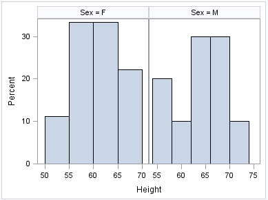
The SGPANEL example shows output that is paneled by gender. The UNISCALE= ROW option ensures that only the shared row axes are identical. The column axes vary based on the values of the height for the respective genders.
Histogram panel
proc sgpanel data=sashelp.class;
 panelby sex /
    uniscale=row;
 histogram height;
run;
Options are available that enable you to customize the histogram and enhance its appearance. For example, you can do the following:
  • control the visual attributes of the bins, such as fill color and outlines.
  • specify the number of bins, their width, and the X coordinate of the first bin.
  • specify legend labels and plot transparency.
  • assign the response variable and the calculated values to the secondary axis (X2 or Y2). This option is available only for the SGPLOT procedure.
Note: This list does not include all available options.

See Also

HISTOGRAM Statement (SGPANEL procedure)
HISTOGRAM Statement (SGPLOT procedure)