Details and Examples: PARETO Procedure
-
Details

-
Examples
 Creating Before-and-After Pareto ChartsCreating Two-Way Comparative Pareto ChartsHighlighting the Vital FewHighlighting Combinations of CategoriesHighlighting Combinations of CellsOrdering Rows and Columns in a Comparative Pareto ChartMerging Columns in a Comparative Pareto ChartCreating Weighted Pareto ChartsAlternative Pareto Charts
Example 15.5 Highlighting Combinations of Cells
This example is a continuation of Example 15.4.
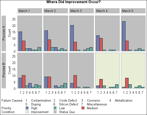
See PARETO1 in the SAS/QC Sample LibraryIn some applications involving comparative Pareto charts, it is useful to classify the cells into groups. This example shows how you can display this type of classification by coloring the tiles and adding a legend.
Suppose that you want to enhance Output 15.4.1 by highlighting the two cells for which Process='Process B' and Day='March 4' and 'March 5' to emphasize the improvement displayed in those cells. Begin by adding a tile color variable (TILECOL)
and a tile legend variable (TILELEG) to the data set Failure4.
data Failure4;
   length tilecol $ 8 tileleg $ 16;
   set Failure4;
   if (Process='Process B') and (Day='March 4' or Day='March 5')
   then do; tilecol='ywh'; tileleg = 'Improvement'; end;
   else do; tilecol='ligr'; tileleg = 'Status Quo'; end;
run;
The following statements specify TILECOL as a CTILES= variable and TILELEG as a TILELEGEND= variable. Note that the variable names are enclosed in parentheses.
ods graphics off;
title 'Where Did Improvement Occur?';
proc pareto data=Failure4;
   vbar Cause / class        = ( Process Day )
                freq         = Counts
                nrows        = 2
                ncols        = 5
                last         = 'Miscellaneous'
                scale        = count
                catleglabel  = 'Failure Causes:'
     /* options for highlighting bars: */
                bars         = ( priority )
                barlegend    = ( priority )
                barleglabel  = 'Priority:'
     /* options for highlighting tiles: */
                ctiles       = ( tilecol )
                tilelegend   = ( tileleg )
                tileleglabel = 'Condition:'
                intertile    = 1.0
                cframeside   = ligr
                cframetop    = ligr
                nohlabel
                nocurve;
run;
In the chart, shown in Output 15.5.1, the values displayed in the legend labeled Condition: are the levels of the TILELEGEND= variable.
Output 15.5.1: Highlighting Specific Tiles
